


Poor text contrast is one of the most common accessibility failures, making online collections harder to read and use. That’s where the Web Content Accessibility Guidelines (WCAG) and related standards come in.
WCAG contrast ratios help ensure that text and interface elements in digital collections remain readable for people with low vision, colour-vision deficiencies and other visual accessibility needs.
WCAG 2.2 is the latest published version, and Level AA is the level most commonly referenced in accessibility policies and regulations. It sets clear criteria—for example, minimum color contrast ratios (covered below), text alternatives for images, and adaptable layouts.
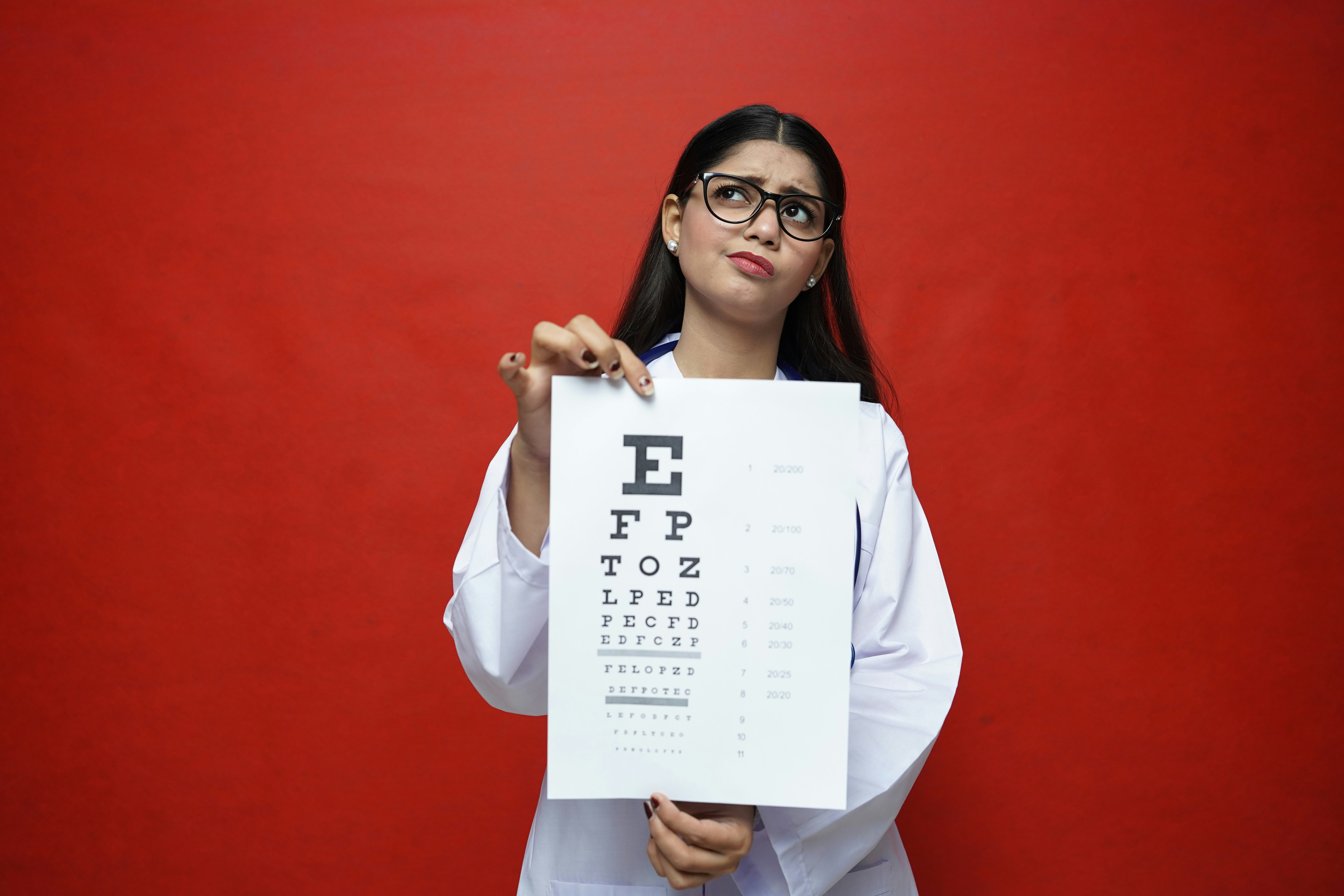
WCAG 2.2 is the latest version of the international Web Content Accessibility Guidelines, with Level AA being the conformance level most often required. It sets clear criteria—for example, minimum color contrast ratios (covered below), text alternatives for images, and adaptable layouts.
However, most regulations, including the U.S. Department of Justice rule (April 2024), still reference WCAG 2.1 Level AA as the minimum legal standard. Likewise, private universities and other organizations receiving federal funding are expected to comply under Section 504 of the Rehabilitation Act, with WCAG 2.1 Level AA widely recognized as the benchmark.
What text contrast ratios does WCAG 2.2 Level AA require?
The minimum contrast ratio depends on whether WCAG classifies the text as normal or large.
|
Text classification |
Minimum Level AA contrast ra |
|---|---|
|
Normal Text |
4.5 : 1 |
|
Large Text |
3 : 1 |
What counts as large text under WCAG?
WCAG defines large text as at least 18 point when it is not bold or at least 14 point when it is bold. In CSS pixels, these measurements are approximately 24px for regular text and 18.7px for bold text.
Text below these thresholds is treated as normal text and must meet the minimum 4.5:1 contrast ratio.
Is any text exempt from WCAG contrast requirements?
WCAG 2.2 Success Criterion 1.4.3 does not apply to text that is part of an inactive user-interface component, purely decorative text, text that is not visible to anyone or text within a logo or brand name.
Text that forms part of an image containing other significant visual content—for example, lettering captured within a historical photograph or scanned newspaper page—is also treated differently from interface text. However, this does not mean that the collection is automatically accessible. OCR accuracy, reading order, semantic structure and the availability of appropriate text alternatives can still affect whether people using assistive technologies can access the content.
How do you test a colour contrast ratio?
To test contrast, enter or select the foreground and background colours in a contrast-checking tool. The tool will calculate the ratio and indicate whether the combination meets WCAG Level AA requirements for normal and large text.
Test colours in the context in which they will actually appear. Hover, focus, selected, disabled and error states may use different colours from the default interface and should be reviewed separately.
There are a number of free tools available to help you check whether your designs meet WCAG 2.2 Level AA contrast requirements. Three convenient, web-based tools that are intuitive to use include:
Below are some examples of color combinations from within the GLAM showcasing how easy it is to fall short of accessibility standards.
Practical tips for color and contrast
When designing or customizing a platform to host your digital collection or archive:
- Test colour combinations early in the design process.
- Check normal, hover, focus, selected and error states.
- Avoid relying on colour alone to communicate meaning.
- Add text, icons, patterns or other visual indicators where needed.
- Use an appropriate overlay when placing text over an image or gradient.
- Be careful with light tones. Pale grays, pastels on white, and mid-tones against similar hues almost always fail.
- Avoid orange for small text. It’s one of the hardest colors to contrast at normal font sizes.
- Steer clear of red/green combinations, as common forms of color blindness make these indistinguishable.
- Be careful with blue/yellow combinations, as they can produce low contrast in certain shades and can be difficult for users with tritanopia (blue-yellow color blindness) to distinguish.
How does Veridian support accessible colour contrast?
Veridian’s default platform design meets WCAG 2.2 Level AA text contrast requirements.
Libraries and archives can customise their collection’s colour palette to reflect their brand, but customised colours must also be tested to ensure that text and interface components remain readable.
We provide guidance to help clients balance brand requirements with accessibility and recommend retesting contrast whenever interface colours or themes are changed.
For more information on Veridian and web accessibility standards please contact us.